Class 7 - CSS layout
Element Basics - Margin, Padding and Border
Way back in class 2, we talked about how some elements are block level (meaning they take up large sections of the page), and some elements are inline (meaning they format or modify text or in-line content). When we want to use CSS to layout our page, typcially we're going to be dealing with block level elements like h1, p, and divs to name a few.
Note: We can override the inline / block status of an element by changing the display value like this:
p {
	display:inline;
}
The first thing to understand about block level elements, is that they all have 3 very important attributes - margin, padding and border. Consider the following image:
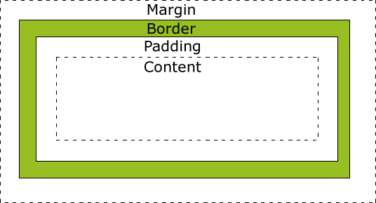
In the image above, we see a standard "box model" for any block level image. It's important to understand what's going on here. Basically, every block level element has the following components...
- Content
- The content is what's "inside". Typically this is text (like the paragraph above), but could also be an image, a video, or even another block level element.
- Padding
- The padding is the space between the content and the outside of the element. Think of a present you might get for your Birthday. Inside a box is the actual present (let's say it's an Angry Birds plush toy). Between the cardboard of the box, and the present, you might have some packing peanuts, or bubble wrap. That's the "padding".
- Border
- The border is the outside of our present - this is the cardboard box itself! Some cardboard is thin, some is thick. How thick that is is what we call the border on an HTML element.
- Margin
- Margin is how far away from another element you want this element to be. Suppose you have 2 presents for your Birthday on the table. If they are 6 inches apart, then you can say each one has a 3" margin.
With CSS we have the ability to exactly control EACH (margin, border, padding) of these for each site (top, left, right and bottom).
To set the margin, and padding, we use the css declarations "margin", and "padding" respectively like this:
SELECTOR {
	margin:10px;
	padding:5px;
}
Short Cuts
The example above will set the margin for all 4 sides of the element (top, right, bottom and left) to be 10 pixels and the padding to be 5 pixels. However, we can also set the margin and padding by a specific side like this:
	margin-left:10px;
	margin-top:10px;
	margin-bottom:10px;
	margin-right:10px;
But that's a lot of typing, so thankfully, there's a shortcut. We can set all 4 sides in one declaration like this:
margin:10px 5px 0px 20px;
In the example above, the top margin is 10px, the right margin is 5px, the bottom margin is 0px and the left margin is 20px. The way to remember the order is to start at the top, then rotate around the element clockwise!
There's also a second shortcut:
margin:5px 20px;
This example will set the top and bottom margin to be 5px and the left and right margin to be 20px.
Note: If you want to center an element on the page, you can set the margin to 0px auto like this:
SELECTOR {
	margin:0px auto;
}
This will make the left and right margins the same - which will center the element.
The short cuts above work for both padding and margin
Setting the border
Setting the border of an element requires a few more parameters. In general, when creating a border, you need to specify how wide it is, what color you want it to be, and what type (solid, dashed, etc). To do this, there are 3 properties you need to know...
	border-color:red;
	border-width:5px;
	border-style:solid;
Much like margin and padding, we can specify what "side" we want to change by adding the top,left,right,bottom to our declaration like this:
	border-right-color:red;
	border-top-color:green;
	border-bottom-color:blue;
	border-left-color:yellow;
Or, we could shortcut them all together using the Top->Right->Bottom->Left shortcut like this...
border-color:green red blue yellow;
It's important to note, to get our borders to work properly, we need to set a width, style and color for every side. 4 sides X three attributes = 12 items we need to declare! More often than not, we're looking to just add the same border around the entire element. So there's another shortcut...
border:1px solid red;
This shortcut is in the format of border: width style color and will apply the width, style and color to all for sides. Maybe we just want a 1px solid brown border on the bottom, we can do that like this...
	border:0px; /* No border at all anywhere */
	border-bottom: 1px solid brown; /* 1px solid brown border on the bottom */
The Box Model
The graphic above outlines the box model to some extent, but it's important to understand that how content+margin+border+padding add up will dictate how "wide" your element is. Consider the following:
How a block level element works:
Some examples (border is red, margin is black)
Notice how each div is the same width and height for content, but have different overall widths and heights based on the margin and padding.
NOTE IE6 Has "issues": http://css.maxdesign.com.au/listamatic/about-boxmodel.htm.
Positioning your elements
In order to layout your page, you need to know a few things about how your design will "fit" together. Knowing how the box-model works is important, but you also need to understand the basic "flow" and the "size" of elements. Let's start with size. By default, the size of any block level element is 100% of the width of the container, and as tall as the element need to be to fit all of it's content. So, say we have an element that's inside the body of the document and it has an image thats 100px tall. If the screen resolution is 1024 x 768 (a pretty common size), then the element will be 1024px wide and 100px tall. BUT, we can override that information by setting the width and height manually, like this...
SELECTOR {
	width:400px;
	height:200px;
}
Pretty straightforward stuff. What's the actual width and height? That will depend on the box model (so we need to worry about margin and padding too).
Layout Flow
By default, sibling elements (that is to say, elements that are at the same level deep as other elements) will always be rendered from the bottom-left corner of the previous element. This is the "relative" postioning and is the default for all block-level elements.
Sometimes, we want to have more control, so we have the ability to "absolutely" position elements. That is to say, we take them out of the standard bottom left relationship, and position them according to the top-left of the containing element.
Finally, we may want to still use the relative positioning, but instead of the bottom-left, we want the top-right or top-left of the previous element to be used as our reference point, we can do that too with floating. Here's some examples (make sure to view source to see what's going on:
Relative Positioning
SELECTOR {
	width:300px;
	height:200px;
	position:relative;
}
In the example above, I'm giving the element a width of 300px and a height of 200px. I'm also telling the browser to position the element relative to the previous element.
An example of relative positioning: relative.html
Absolute Positioning
SELECTOR {
	width:300px;
	height:200px;
	position:absolute;
	top:10px;
	left:20px;
}
In this example, I'm telling the browser I want this element at an EXACT location in reference to it's parent element. I want the upper left corner of this element to be 10px from the top and 20px from the left of the upper left of the parent element. I can set the top, bottom, left and right position using the appropriate declarations.
An example of relative positioning: absolute.html
Floating
Sometimes you want to take advantage of the natural flow of relative positioning, but need a little more control. That's where floating comes in. Say you want to align an image to the left, and have the text "wrap" around the image, you do that like this:
img {
	float:left;
}
You can also float entire sections of your page using the same concept. Here's a better example: float.html.
Layers / z-index
The final point in todays notes will be layering items on your webpage. The best analogy to this is the old overhead projectors in class rooms (or, photoshop layers if you've used that). Basically, every div or block level element can be thought of as a sheet. You can cut the sheets to any size and move them around using the methods we mentioned above, BUT you can also overlay each element. The trick is to understand what elements are on top and what ones are underneath. Without getting into the nitty-gritty of how these are defaulted (they're different for each browser), I'm just going to mention that you can manually override them using the z-index property like this...
SELECTOR {
	position:relative;
	z-index:100;
}
Two points here: 1) any element positioned using the z-index should also have a position declaration (absolute or relative), and 2) the higher the number, the more "on top" the element is. To see an example, check out zindex.html.
Suggested Videos
Note: These are just some videos I found on youtube that I feel are related to the topics covered here.